About ME
WHo AM i
I have worked in the marketing field for over 15 years. My
experience overly lies in everything encompassing brand from
Senior Brand and Creative Manager to Graphic Designer.
Wherein, I have demonstrated a keen ability to lead
and influence all stakeholders with my communication and
creativity.
Given the opportunity, I am confident to bring value add to
any organisation, utilising my skill sets, experience and
education.
EDucation
learning
2018
UBC/DAA Certificate Digital Analytics
UBC Sauder School of Business2003
Digital Design Diploma
Vancouver Film SchoolExperience
involvement
2020
November 2013 - December 2020
Senior Brand & Creative Manager
Ooredoo Myanmar
• Act as an authority and promoter of the Brand,
ensuring consistent brand expression through all
consumer touch points both external and internal
• Lead on defining and implementing the company’s
corporate brand and communication strategy,
providing creative communication direction and best
practices across marketing units
• Oversee the development and execution of brand
campaigns, brand activations, brand retail
experiences and ensure they deliver the expected
return either in brand awareness, brand equity,
brand positioning or brand affinity
• Oversee the development and execution of product
campaigns that effectively communicate function and
brand identity
2013
November 2012 - June 2013
Art Director/Project Manager
Digicel Myanmar
• Art Direct IOS App telecom business proposal
• Lead UI/UX designer
• Responsible and accountable for external
development teams work and progress
2012
January 2009 - May 2012
Senior Designer
Digicel Pacific
• Develop and design brand campaigns, brand
activations, brand retail experiences and ensure
they deliver the expected return either in brand
awareness, brand equity, brand positioning or brand
affinity for 8 countries
• Develop and design product campaigns that
effectively communicate function and brand identity
for 8 countries • Write, direct, film and animate
television commercials and other promotional
videos
• Direct photoshoots to ensure photography meets
brand standards of quality and energy
• Work with Head of Brand and Advertising to ensure
brand standards are met and exceeded
• Lead and supervise junior designers on project
execution
2008
January 2005 - February 2008
Senior Designer
Insight Film Studios
• Design and develop opening title sequences for
films and TV movies
• Design posters for films and TV movies for
national and international sales
• Design and develop company website and external
film websites
• Lead and supervise junior designers on project
execution
get in touch
contact me
How can I help you ?
portfolio
MY work

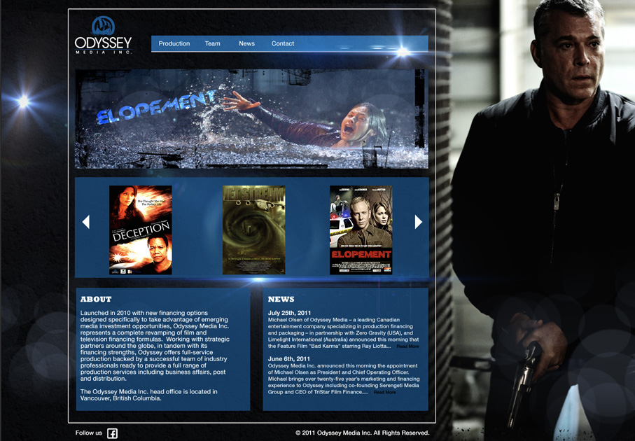
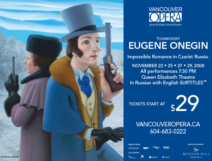
Insight Film Studios
poster designs
Click to view
Craft Media Collective
Landing Pages & Display Ads
Click to view
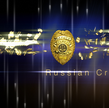
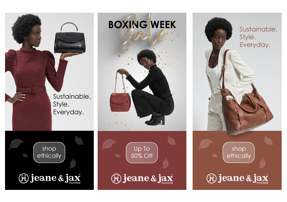
Ooredoo Myanmar
Burmese Python 5Ks/1MB Campaign
Click to view
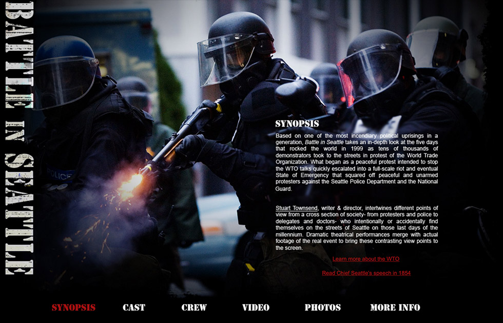
Insight Film Studios
Battle in Seattle website
Click to view


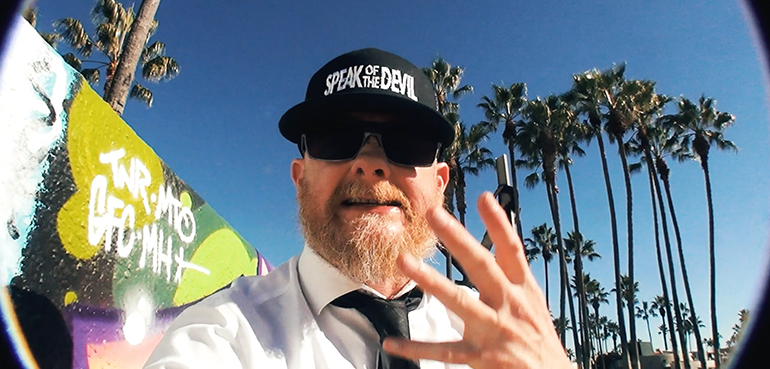

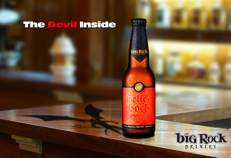

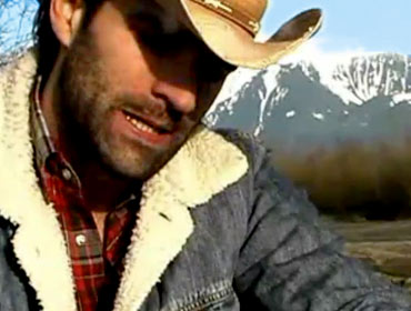
Big Rock Mountain
Big Rock Beer $10,000 Winner
Click to view

Unwired
Brand Launch Campaign
Click to view


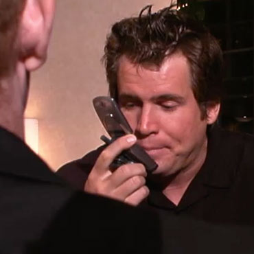
The Best Stuffs in Here
Big Rock Beer contest finalist
Click to view

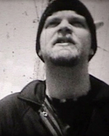
Canes
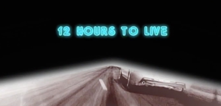
Main Title Sequence
Click to view

Digicel Pacific
Christmas Campaign TVC
Click to view
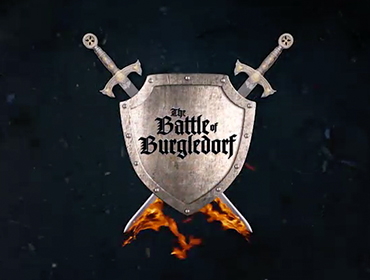
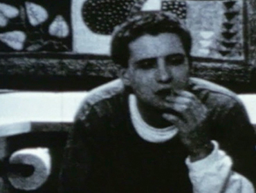
The Battle of Burgledorf
Main Title Sequence
Click to view

Running with the Bulls
Widest Network Campaign TVC
Click to view

Christmas Town
Main Title Sequence
Click to view