


|
|
 ::film posters
::logos
::pamphlet/magazine
::clothing
::FILM POSTERS
::LOGOS
::PAMPHLET/MAGAZINE
::CLOTHING
::film posters
::logos
::pamphlet/magazine
::clothing
::FILM POSTERS
::LOGOS
::PAMPHLET/MAGAZINE
::CLOTHING
| NUMB |
The identity of this poster reflects Mathew Perry's characters disassociation with the world. |
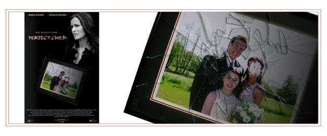
| PERFECT CHILD |
The identity of this poster reflects the hate the stepchild feels for her new stepmother. |
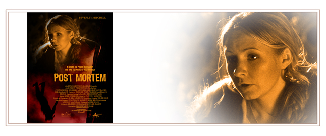
| POST MORTEM |
The identity of this poster reflects the heroine's lossness due to a murder she see's that supposedly never happened. |
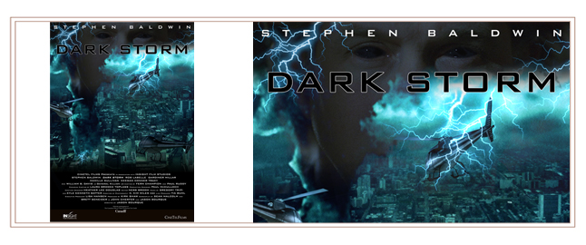
| DARKSTORM |
The identity of this poster reflects both the protaganists infection due to dark matter and the storms that the dark matter unleashes.. |

| STRANGER IN MY BED |
The identity of this poster reflects the fear the heroine has for her abusive husband. |
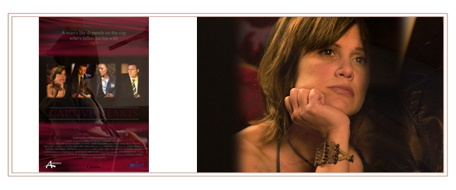
| CAPTIVE HEARTS |
The identity of this poster reflects the heroines confusion between the love for her kidnapped husband and her emotions for the cop who is trying to find him. |

| LET'S TALK SEX |
This logo was designed for a television talkshow that reflects its demographics. |

| CONVERGENT ENTERTAINMENT |
This brand identity is one of sophistication to establish oneself immediately in the entertainment field. |
| LATITUDE |
The logo's bright eye catching colours are used to represent both summer and winter and the stylized latitude line promotes a feeling of continuous motion and traveling. |

| AMBITIOUS ENTERTAINMENT |
This brand identity is established with the film strip and the giant 'A' reinforces the actual name. |
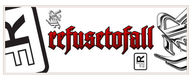
| REFUSE TO FALL |
Refuse To Fall's logo identity reflects its tough brand personality. |
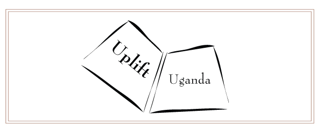
| UPLIFT UGANDA |
The logo is a simple stylized book that effectively portrays the company and literacy. |

| GOLD CHAINS |
The gold G and C are interlocked like a chain link to convey the company's identity. |
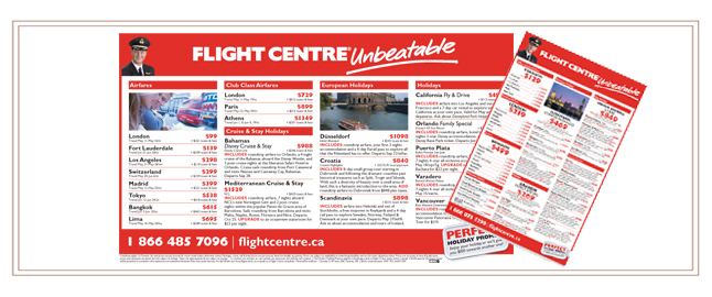
| FLIGHT CENTRE |
I designed print adverstisements for the North American market that were consistent with their brand identity. |
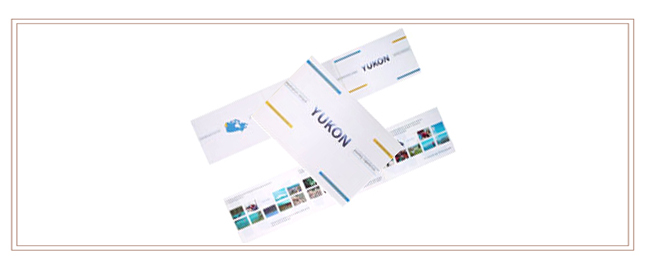
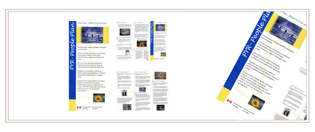
| LATITUDE |
Latitude's main objective in attracting clients is by first and foremost their promotion of the Yukon. The pamphlet accomplishes this by the numerous summer and winter pictures, descriptive words and content that flows in a vertical direction consistent with lines of latitude. The package is non-typical pamphlet shape that also stays consistent with latitudes new and stylish identity. |
| ENVIRONMENT CANADA |
The pamphlet uses bright summer colours, large bold print and pictures to depict a warm easy going feeling that was important in capturing the attention of the audience and is a stark contrast to the governments usual conservative style. The pamphlet heightens the key issues of caring and togetherness by the use of winning and non-winning contest pictures and by the line that connects them. |
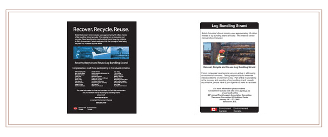
| ENVIRONMENT CANADA |
I used large print and a commonplace picture to grab viewer's attention and to make it easy for a quick read through. The second was a full page advertisement designed with a black background with white print and blue pictures to dominantly standout. |
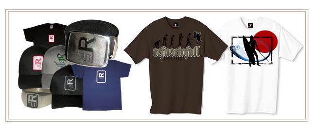
| REFUSE TO FALL |
This clothing was designed staying true to the company's identity and brand. |